COVID-19 Chart with D3.js

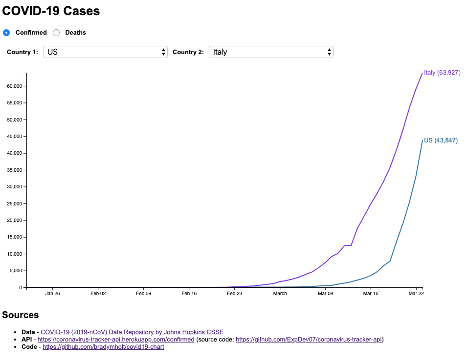
As I watched all the dire news unfold about COVID-19 recently, I decided this would be a good opportunity to learn D3.js, a JavaScript library that helps you build data visualizations. I’ve seen amazing demos from this library but hadn’t taken the plunge to try it out. I thought I could take the daily COVID-19 data and plot a line graph, so I could see trendlines and comparisons between countries.
Searching for a source for the data, I quickly found the Johns Hopkins CSSE Data Repository on GitHub which is being updated frequently. The data is stored in CSV format so I needed a way to load it into a website. Fortunately, I found this issue: https://github.com/CSSEGISandData/COVID-19/issues/8 where someone posted about a JSON API they created for easy access to the data.
Now that I had easy access to the data, it was time to start learning D3.js. When I started looking at line chart examples linked from the documentation site, like this one: https://observablehq.com/@d3/line-chart I honestly got a little intimidated. There’s quite a bit going on with the code to render a simple line chart. I read the code and comments and tried to follow along. Also, I came across this line chart example: https://bl.ocks.org/d3noob/402dd382a51a4f6eea487f9a35566de0 which I found a bit easier to follow. I created a simple index.html file, loaded in D3.js and started playing around to understand how it works.
I took the data from the API and mapped into a format that looks like this:
{
  "maxDate": "2020-03-26T05:00:00.000Z",
  "maxCount": 101657,
  "countries": [
    {
      "country": "US",
      "data": [
        {
          "date": "2020-01-22T06:00:00.000Z",
          "count": 1
        },
        ...
        {
          "date": "2020-03-26T05:00:00.000Z",
          "count": 83836
        }
      ]
    },
    {
      "country": "Italy",
      "data": [
        {
          "date": "2020-01-22T06:00:00.000Z",
          "count": 0
        },
        ...
        {
          "date": "2020-03-26T05:00:00.000Z",
          "count": 80589
        }
      ]
    }
  ]
}
Then, going off of the examples I found and tweaking a bit, I ended up with the following renderData that actually draws the SVG line chart.
/**
 *
 * @param chartConfig
 * @param chartData chart data in the format:
   { "maxDate": "2020-03-26", "maxCount": 101657, countries: [ { "country": "US", data: [ { "date": "2020-01-22", "count": 123} ] } ] }
 */
function renderData(chartConfig, chartData) {
  // Remove any previous lines
  d3.selectAll("g > *").remove();

  // Scale the range of the data
  chartConfig.x.domain(
    d3.extent(chartData.countries[0].data, function(d) {
      return d.date;
    })
  );
  chartConfig.y.domain([0, chartData.maxCount]);

  // Add line for each country
  for (let i = 0; i < chartData.countries.length; i++) {
    const countryData = chartData.countries[i].data;

    // Build the line
    const line = d3
      .line()
      .x(function(d) {
        return chartConfig.x(d.date);
      })
      .y(function(d) {
        return chartConfig.y(d.count);
      });

    // Add the line to the chart
    chartConfig.svg
      .append("path")
      .data([countryData])
      .attr("class", `line country${(i + 1).toString()}`)
      .attr("d", line);

    // Add legend
    chartConfig.svg
      .append("text")
      .attr("transform", "translate(" + (chartConfig.width + 3) + "," + chartConfig.y(countryData[countryData.length - 1].count) + ")")
      .attr("dy", ".35em")
      .attr("text-anchor", "start")
      .attr("class", `legend country${(i + 1).toString()}`)
      .text(`${chartData.countries[i].country} (${chartData.countries[i].data[chartData.countries[i].data.length - 1].count.toLocaleString()})`);
  }

  // Add the x axis
  chartConfig.svg
    .append("g")
    .attr("transform", "translate(0," + chartConfig.height + ")")
    .call(d3.axisBottom(chartConfig.x));

  // Add the y axis
  chartConfig.svg.append("g").call(d3.axisLeft(chartConfig.y));
}
After I worked on this chart, I came across How to learn D3.js, by Amelia Wattenberger, which is a wonderful resource I wish I had found initially. If you are interesting in learned D3.js I highly recommend taking a look at it.
That’s it! This was a fun project to build and I learned a bit about D3.js that I can hopefully put to use in the future.
The full source can be found in this repository on GitHub: https://github.com/bradymholt/covid19-chart and the live site can be found here: https://bradymholt.github.io/covid19-chart/.